Overriding the Bootstrap Theme
In our project, we create a custom visual style by overriding the default Bootstrap theme. Instead of modifying compiled CSS, we take a cleaner approach — directly adjusting SCSS variables within the Bootstrap source.
Theme Properties
Clone the Bootstrap repository
First, clone the official Bootstrap repository for the desired version ({{bs_version}}):
git clone --branch v5.3.3 https://github.com/twbs/bootstrap.git
cd bootstrap
npm install
Build Bootstrap example
Now you can build the default Bootstrap template together with the testing page.
npm start
Inject variables override
Create a variables override SCSS file in the Bootstrap repository at scss/_variables-override.scss. Then, modify all scss/bootstrap*.scss files to import this new variables file right before the original variables.scss import.
Here's a more detailed explanation:
- Create a new file named
_variables-override.scssin thescssdirectory:
// here you can override any variable definition originally located in _variables.scss file
$primary: #123456 !default;
$secondary: #456789 !default;

$body-tertiary-color: #789456 !default;

$body-bg: #eee !default;
$white: #fff !default;

$font-family-sans-serif: "Roboto" !default;

$font-family-base: $font-family-sans-serif !default;
- Add variables import into all of
scss/bootstrap*.scssfiles:
@import "functions";

@import "variables-override";

@import "variables";
@import "variables-dark";
- Review override
After making changes to the SCSS files, you have two options:
-
If you've already started the development server with
npm start, the changes will be automatically rebuilt when you save the files. -
If the server isn't running, execute
npm startto build and serve the project.
Once the server is running, open your browser and navigate to /docs/5.3/examples to see the changes. For the best overview of your customizations, visit the Bootstrap Cheatsheet page at /docs/5.3/examples/cheatsheet/, which showcases all Bootstrap components on a single page.
Tip: The Cheatsheet page is particularly useful for reviewing your theme changes as it displays almost all Bootstrap components and utilities in one place.
Font Overrides
For custom typography, you can override Bootstrap's font variables. While you can use local fonts, for testing purposes, it's convenient to use Google Fonts or Base64-encoded fonts directly in your SCSS.
Here's how to implement custom fonts in your _variables-override.scss:
// Option 1: Import Google Fonts directly in SCSS
@import "https://fonts.googleapis.com/css2?family=Roboto:wght@300;400;500;700&display=swap";

// Option 2: Base64 encoded font (useful for offline development)
@font-face { font-family: 'CustomFont'; src: url(data:font/woff2;base64,<<your-base64-encoded-font>>) format('woff2'); font-weight: normal; font-style: normal; }

// Override Bootstrap's font variables
$font-family-sans-serif: 'Roboto', system-ui, -apple-system, sans-serif;

$font-family-base: font-family-sans-serif;
$font-weight-normal: 400;
$headings-font-weight: 500;
Note: Avoid importing font sources directly in SCSS. While this approach works for testing, in the target application we include fonts as assets. Therefore, use these imports only for visual testing and remove them before the final template build.
Building the Bootstrap Theme
Once you've customized your Bootstrap theme with variable overrides and tested it thoroughly, you'll need to build the production-ready files for your application.
To generate the minified distribution files, run:
npm run dist
This command will create optimized assets in the dist directory. For your application, you'll need two key files:
dist/css/bootstrap.min.css- the compiled and minified CSS containing your custom theme.dist/js/bootstrap.bundle.min.js- the minified JavaScript bundle with Bootstrap's interactive components.
Tip: The
distdirectory also contains source maps (*.mapfiles) and non-minified versions, but for production use, the minified files are recommended for optimal performance.
Theme Font
When working with custom fonts in our Bootstrap-based theme, special consideration is needed for Bootstrap Studio compatibility. Bootstrap Studio has specific requirements for font integration that we need to follow.
Font Format Requirements
Bootstrap Studio works best with the WOFF2 (Web Open Font Format 2.0) format. This modern font format provides optimal compression and faster loading times. To ensure compatibility:
- Convert your font files to WOFF2 format using Transfonter
- Make sure to include all necessary font weights and styles (regular, bold, italic, etc.)
Font Integration Process
- Prepare Your Fonts:
- Gather your original font files (TTF, OTF, etc.)
- Visit Transfonter
- Upload your fonts and select WOFF2 as the output format
- Download the converted files
- Bootstrap Studio Integration:
- Follow the Bootstrap Studio Web Fonts guide
- Import the converted WOFF2 files into your project
- Define your
@font-facerules in the CSS
Important: While testing font variations in development, you can use Google Fonts imports directly in SCSS. However, for the final template and Bootstrap Studio compatibility, always use locally hosted WOFF2 files.
Example Font-Face Declaration
After converting your fonts with Transfonter, you'll receive a CSS stylesheet containing @font-face declarations. This generated stylesheet is ready for direct import into Bootstrap Studio, ensuring proper font integration in your design workflow. The structure follows the modern best practices for web font implementation.
@font-face {
    font-family: 'YourFont';
    src: url('YourFont-Regular.woff2') format('woff2');
    font-weight: 400;
    font-style: normal;
    font-display: swap;
}

@font-face {
    font-family: 'YourFont';
    src: url('YourFont-Bold.woff2') format('woff2');
    font-weight: 700;
    font-style: normal;
    font-display: swap;
}
Integration to Project
The Oidis Framework uses a standardized project structure that simplifies Bootstrap theme integration. The process follows a structured approach to maintain consistency across projects.
Create a template directory in your project's resource folder with the following structure:
resource/
└── template/
    ├── _variables-override.scss
    ├── LICENSE
    ├── {{theme_name}}.min.css
    └── {{theme_name}}.min.js
Note: Where
{{theme_name}}is unique name same as project or project symbolic name to distinguish multiple templates next in Bootstrap studio.
Importing Custom Theme into Bootstrap Studio
After preparing your theme in the project, you can import it into Bootstrap Studio by following these steps:
Preparation
- Open Bootstrap Studio
- Create a new blank project or open an existing one
- Before importing, switch the design file to the default Bootstrap theme to prevent import conflicts
Important: To avoid import failures, ensure you're not using the theme you're about to import in the current project.
Import Process
Step 1: Access Theme Settings
- Open Bootstrap Studio's settings panel
- Navigate to the
Templatessection
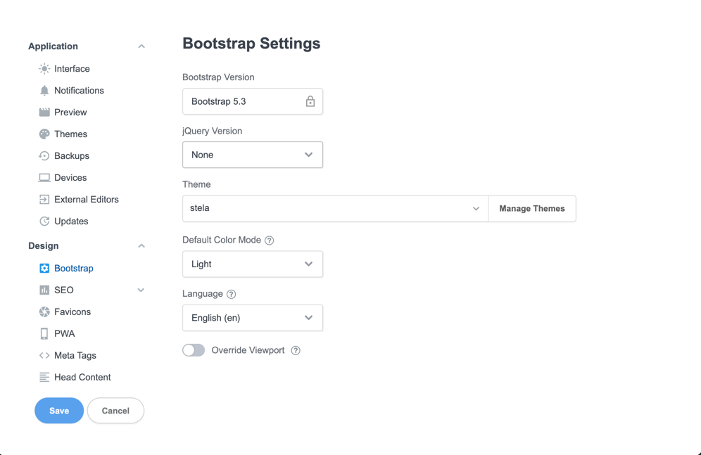
Step 2: Import Theme
- Close the settings dialog (required to prevent import issues)
- Click the
Import Themebutton - Select your
{theme_name}.min.cssfile
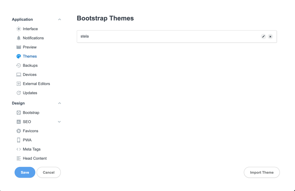
Step 3: Apply Theme
- Go to the
Bootstraptab - Select your newly imported theme from the list
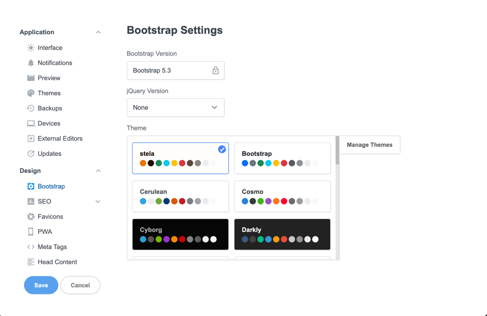
Updating Existing Themes
When updating an existing theme:
- Import the new version of your theme
- Bootstrap Studio will automatically rename the older version (e.g.,
{theme_name}-1) - Verify the new theme is working correctly
- Remove the old theme version:
- Open Theme settings
- Locate the older version
- Click remove
- Close and reopen settings if needed
Note: Bootstrap Studio might require closing and reopening the settings dialog between certain operations. This is a known behavior of the application.
Your custom theme is now ready to use in Bootstrap Studio!
See also: Icons | User Controls